Ever wonder if your NFT project can truly stand the test of time? In this post, we dive into how NFTs are performing by looking at real market data like trade counts and floor prices.
It’s like taking a quick snapshot of buyer interest to see how strong a project really is. We sift through sale prices and active trader numbers to paint an honest picture of these digital assets.
This benchmarking study shows you where the real action happens and helps you spot trends that might signal outstanding NFT performance in a bustling market.
nft benchmarking analysis: Stellar NFT Performance
NFT benchmarking analysis looks at market value, trade counts, and floor prices to see how NFT projects are really doing. The floor price is a quick way to sense what buyers feel, imagine checking your favorite marketplace and noticing that a bump in the floor price hints that buyers are buzzing with renewed interest. This method gives investors a clear peek into an NFT collection's strength and appeal.
Market data is absolutely key here. For example, OpenSea shows an average sale price of about $940, supported by around $14.68 billion in trade volume and roughly 1.39 million active traders. These numbers serve as solid benchmarks, helping investors spot shifts in digital asset popularity. Plus, indexes like the Nansen NFT-500 offer weekly snapshots to show which collections are currently leading the pack.
Big sales add even more context. Take Beeple’s “Everydays,” which sold for an eye-popping $69.3 million. That record-breaking sale shows how one standout project can really shake up market trends. Investors use these benchmarks to check current performance and also to hunt for potential opportunities in crypto tokens and related markets, all while keeping an eye on the ever-changing NFT ecosystem.
Methodologies for NFT Benchmarking Analysis: Data Selection & Sampling

We analyzed data from a 120-day period ending November 15, 2022. At first, our tests only looked at 44 NFT projects minted by smart-money wallets, wallets run by savvy investors. Later, we expanded our study to include 2,644 projects. This larger sample helps us see how NFT projects perform over time, kind of like switching from a small town weather update to a national forecast.
We checked performance at hold periods of 1, 7, 14, and 30 days, with each timeframe telling a unique part of the story. A quick look might show that a project with just one smart-money minter can do well for a short span, but over 30 days, you need a lot more smart-money action to say it’s really strong. It’s like needing enough strong votes to help a team win.
Market trends also play a big role. Since June 2022, the NFT market has cooled off. The NFT-500 index shows a 37% drop in ETH value this year and a 78% decrease when measured in USD. These numbers remind us that benchmarks are more like helpful guides than foolproof predictions. Each metric adds a piece to the puzzle, so investors can compare projects, study chain trends, and look at overall analysis methods.
Key Performance Metrics in NFT Benchmarking Analysis
Total unique holders is a really important number. It tells you if a small group controls most tokens or if many people have a stake. When just a few wallets hold a lot, a handful of investors might sway prices. So, keeping an eye on this metric shows if the digital asset is spread out or held by select insiders.
First-time buyers are another key indicator. They show fresh interest, much like new home buyers can bring energy to a community. When new collectors keep joining, it not only boosts the project's liquidity but also helps keep prices stable over time.
OTC activity, which means trades arranged privately before they hit the public market, gives extra insight. It shines a light on which savvy investors are making moves behind the scenes. Tracking these trade moves can reveal changes in behavior that might not be visible in regular, listed transactions.
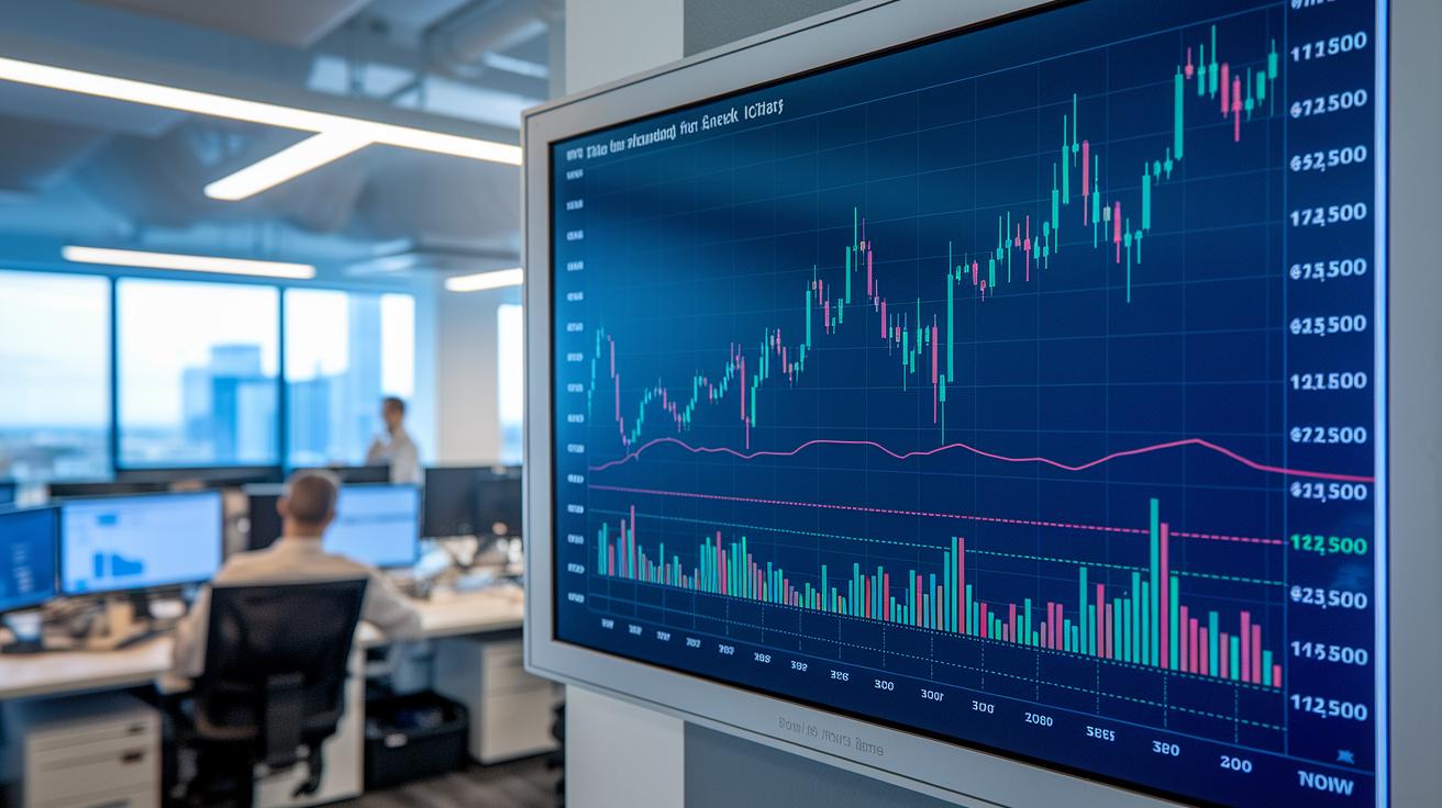
On-chain activity brings its own set of clues. For instance, the floor price is a go-to gauge for market sentiment. If you want a closer look, check out this market sentiment analysis: https://nftcellar.net?p=1312. Along with the floor price, metrics like trade counts and average sale price help sketch out the project’s liquidity and overall performance. Together, these indicators can reveal how volatile or steady the market might be.
Network analysis adds another valuable layer. It maps out how wallet clusters connect and exposes common buyer behavior patterns in the ecosystem. By merging these insights, investors can compare risk and return more clearly, guiding them to make smarter decisions in the dynamic world of digital assets.
Case Studies in NFT Benchmarking Analysis: Beeple & CryptoPunks
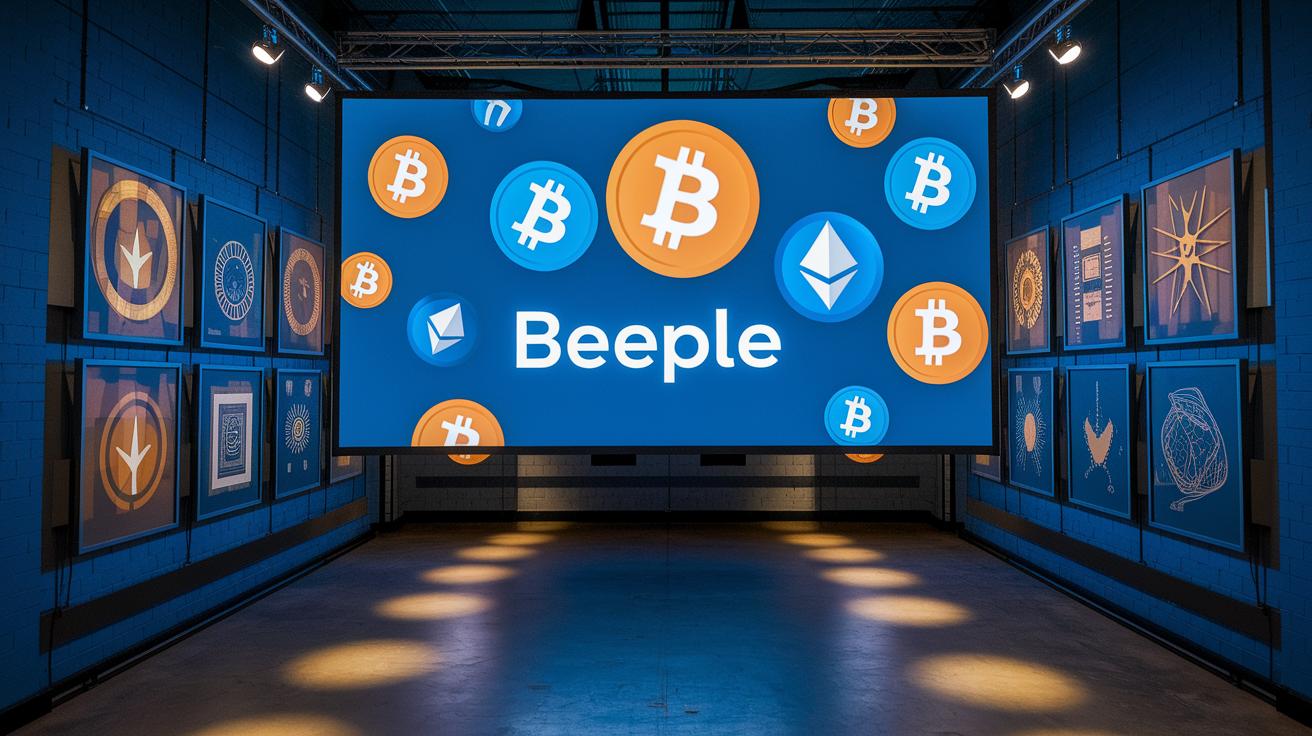
Beeple’s sale of “Everydays” hit a record of US $69.3 million. This huge sale shows how one big deal can change what everyone expects from the market. It’s like a headline event that makes everyone take notice. Imagine a sale so massive that it turns the usual market thinking upside down, Beeple’s record deal did just that.
CryptoPunks, on the other hand, are studied using different kinds of numbers. Analysts look at things like the total number of unique holders, the count of first-time buyers, trades done over the counter (OTC), and clusters of wallets. Each piece of this puzzle helps us understand the overall picture better. For example, if a few wallets hold many tokens, it might mean the price could jump around a lot. And a steady flow of new buyers might be a sign that more people are getting into the market.
The way we look at these numbers changes as people hold on to their assets longer and as more experienced investors jump in. In the short run, even a little bit of smart investor activity can boost profits, but for the long haul, it’s important to have serious, active participation. This difference shows how NFTs can perform in different time frames. When we look at both Beeple’s record sale and the trends in CryptoPunks, it’s clear that using a mix of different numbers helps us see the market more clearly today and even spot what could happen next.
NFT Benchmarking Analysis Tools & Dashboards
Indexes like the Nansen NFT-500 give you weekly updates so you can see how top NFT collections are doing at a glance. They mix market cap charts, liquidity rankings from the trading sites, community sentiment, and on-chain visuals to help you get a clear idea of a project's performance. With these tools, you can watch price shifts, trading volumes, and even spot changes in how the community feels.
Interactive dashboards let you sort NFT projects by details like smart-money minter counts and holding periods. For example, if you set a filter to find projects with at least 30 minters over a two-week period, you can easily spot the ones with steady backing. This shows that tweaking simple settings can highlight trends worth paying attention to.
Other useful tools come with value comparison dashboards that use clear visuals to help you weigh risks against potential returns. You can even check out chart tutorials, like guides on tracking portfolios for crypto and stocks, that show you how to slot these benchmarks into your overall investment strategy. When you rely on these on-chain analysis tools, you get strong, easy-to-understand data that supports smart, data-driven decisions in the NFT world.
Applying NFT Benchmarking Analysis: Investor Strategies
When you check out NFT benchmarks, you'll notice that smart-money thresholds change based on how long you hold. For a short period of 1 to 7 days, even one smart-money minter, a person or group who invests wisely, can hint at a potential profit. When you extend that to 14 days, the rule of thumb is a project should have about 30 NFT-specific minters plus one general smart-money minter. And if you're looking at a 30-day timeframe, sticking with around 30 NFT-specific minters usually shows a strong backing in the market.
These guidelines really help decide where to put your money. Think of it like this: if a project hits the short-term mark with just one smart minter, it might be a little early, like spotting the first green shoots in spring. But if a project needs more minters over a 14- or 30-day period, it can mean there's a deeper level of commitment from the market.
And in tougher bear markets, these benchmarks become super useful filters. They steer you toward projects that maintain steady support, even when overall market vibes are down. By tracking NFT prices, you get a real-time feel for the market mood. So if you're seeking broader tips on NFT investing, keeping an eye on how smart-money moves can really help adjust your strategy as market efficiency grows over time.
Final Words
In the action, we explored how NFT benchmarking analysis helps guide savvy digital investment strategies. We discussed using market statistics like floor prices and trade counts to gauge project performance. You read about diverse data sources, sampling methods, and real-world examples like Beeple’s record sale. We also looked at practical tools and dashboards to track trends and craft entry and exit tactics. This comprehensive look at nft benchmarking analysis leaves you with clear insights to confidently manage risk and seek promising NFT opportunities. Stay positive and keep analyzing!
FAQ
What is NFT analysis and how do you perform NFT benchmarking analysis?
NFT analysis involves comparing key metrics like floor price, trade counts, and market cap. It usually follows five steps: defining goals, gathering data, evaluating metrics, comparing benchmarks, and reviewing market conditions.
How can NFT charts and market data inform price trends and market conditions?
NFT charts show price history, current prices, and market cap changes. They help investors spot potential price drops, track market sentiment, and analyze trends using platforms such as TradingView.
Are NFTs still relevant in 2025?
NFTs remain significant in 2025 as digital assets continue to influence art, collectibles, and virtual items. Their evolving performance and continued market activity support their relevance for investors.

