Ever wonder why some NFT collections blow up while others seem to stall? It might come down to the way we compare their performance. By looking at simple numbers like trading volume, the lowest price you can buy an NFT for, the average sale price, and the number of buyers, you can start to see what makes a collection tick. In short, these key figures help you understand why certain collections really shine while others don’t catch on.
Essential Metrics for Comparative NFT Collection Performance

When you look at NFT collections, a few key numbers stand out. First off, trading volume tells you how busy the market is day by day. Then there’s the floor price, which is like the lowest selling price. If the floor jumps from 1.5 ETH to 3 ETH, that's a clue that buyers are feeling more confident. Next, the average sale price gives you an idea of what people are usually paying, and counting unique buyers shows how many different collectors are in the mix. Lastly, the market cap sums it all up, showing the total value traded over time.
Imagine comparing three blockchain networks like Ethereum, Binance Smart Chain, and Polygon. Each one moves a bit differently. For instance, Ethereum might lead in overall sales and volume because it's a big player in crypto art. On the other hand, Binance Smart Chain might fetch faster sales with lots of unique buyers every day. And even though Polygon’s average sale price could be lower, its low transaction fees help keep the market steady.
Think of trading volume like the sudden rush of excitement on a roller coaster, full of ups and downs that give you a rush when you see a big spike. Keeping an eye on how prices bounce around is just as important. It’s a bit like checking different neighborhoods to see where the hustle and bustle is strongest versus where things are more calm.
In short, checking NFT collection performance isn’t about just one number. You need a mix of daily sales, overall volume, and market cap to get the whole picture. This helps you see not only what’s happening now but also how strong and steady a collection might be over time.
Charting Comparative NFT Collection Performance Trends
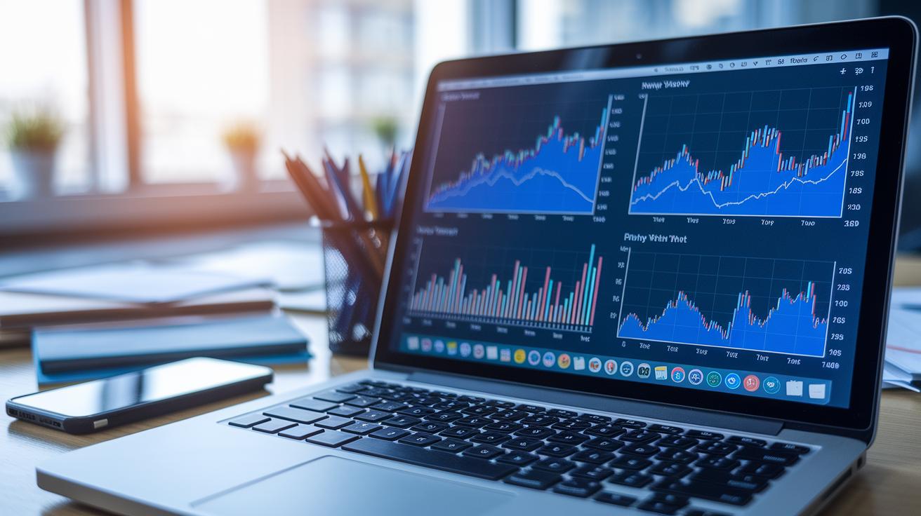
Line charts let you see how a collection's floor price and average sale price move over days and weeks. Imagine tracking a collection that jumps from 1.5 ETH to 3 ETH, such a jump tells you buyers are showing more interest. It’s a bit like watching a boat navigating changing tides.
Bar charts make it simple to compare daily trading volumes and the number of unique buyers. Picture looking at three different collections side by side: one might have 150 sales on a given day, while another only shows 80. This lets you quickly see which collections are getting more attention.
Scatter plots are great for showing how price and volume are related. If you notice that higher prices come with higher trading volumes, it might signal that the market feels really positive about the collection. These graphs turn boring numbers into a little story about how trading activities connect.
Heatmaps add yet another layer of insight by showing days full of busy trading and higher ups and downs. With a simple color code, you can spot days where the market acted out of the ordinary.
When you dig into historical performance data to spot trends, you can use time series models and trend analysis tools to guess what might happen next. By mixing past records with prediction techniques, you can better plan your next investment move.
Comparative NFT Collection Holder Distribution & Engagement Analysis

One strong sign of an NFT collection's long-term promise is when a lot of people are involved. For instance, if 1,000 different crypto wallets hold tokens from a collection, it shows that many different individuals are buying and trading, not just a handful of collectors. This kind of spread often helps keep the market healthy because no one person controls too much.
It’s also useful to look at how often each wallet makes a trade. When collectors are busy buying and selling, it usually means they're really interested in the collection. And don’t forget about the buzz on social platforms like Discord and Twitter. When you see lots of chats and tweets, it gives you a real-time peek at the excitement among buyers.
Another cool aspect is smart contract tracking. This tech watches things like royalty payments and ownership changes, so you can see not just the initial sale but also ongoing buying patterns. It’s a handy way to spot repeat buyers and loyal collectors.
- Unique wallet counts
- How many transactions each wallet makes
- Real-time social chatter from platforms
- Data on royalty flows
All these points together help paint a clear picture of how engaged a community is, which in turn shows how strong a collection might be in the long run.
Rarity Score & Composite Performance Index in Comparative NFT Collection Analysis
Calculating rarity scores is pretty simple. We give each token a score based on how common or unique its traits are. For example, if just 1% of tokens have a special background, those tokens get a higher score, which boosts their perceived value. Isn’t it fascinating how saying “Only 1% of tokens sport this trait” instantly shows how rare and valuable they are?
Next, we mix in other factors to create a composite performance index. This index combines the rarity score with how fast tokens are being bought and sold (that’s the sales velocity) and shifts in the lowest asking price, or floor price. Let’s say a collection’s floor price climbs steadily from 1.5 ETH to 3 ETH over a month. That steady rise hints that more buyers are getting interested.
All these numbers come together to form one clear benchmark. This blend makes it easier to compare different collections at a glance. We track these changes over time with regular snapshots, and rolling-return calculations keep the comparisons fresh. For example, check out this simple table:
| Metric | Example Value |
|---|---|
| Rarity Score | High for 1% unique trait |
| Sales Velocity | Rapid trades on high-demand tokens |
| Floor Price Trend | 1.5 ETH → 3 ETH monthly |
By combining all these metrics, we get a composite index that makes it easy to see which NFT collections are really clicking over time. In short, this approach gives investors a clearer picture to make smarter trading decisions.
Forecasting Model Methodologies for Comparative NFT Collection Performance Analysis

We’re seeing smart systems like machine learning and ARIMA step in to help us predict NFT performance. These methods work with time-based data, making it easier to weigh tech and regulatory risks while giving yield hints. For instance, someone might say, "Before the market shifts, remember how a machine learning model spotted that sudden surge in trading volume?" It’s a simple example showing just how useful these tools can be.
Typically, NFT portfolios hold about 2 to 8% of an investor’s total assets. In extreme cases, they can even track crypto markets up to 85%, showing just how sensitive these assets are to market swings. Investors also use risk metrics like the Sharpe and Sortino ratios, tools that balance risk and reward, to better understand NFT price jumps and liquidity bumps.
When it comes to measuring yield, it’s not just about potential returns. It’s also about keeping an eye on how volatile those returns can be over different market cycles. By reviewing rolling averages and the ups and downs of returns through several trading periods, investors can get a clearer picture of a collection’s true performance.
- Predictive models: Machine learning and ARIMA
- Risk-adjusted measures: Sharpe and Sortino ratios
- Yield studies: Tracking return variability across market cycles
Cross-Portfolio Comparative NFT Collection Performance Review

When checking out different NFT collections, it’s important to look at key numbers like total sales, market cap, and liquidity. Investors often compare popular platforms like OpenSea (which owns about 60–70% of the market) with more specialized ones such as Foundation. This method gives a clear picture of both the big market trends and niche buyer behaviors.
A good look at liquidity means checking transaction speed, volume, and fees. For example, NFT collections on Ethereum might have higher fees and slower speeds than those on layer-2 chains like Polygon or Arbitrum. These networks, with lower fees and faster transactions, create a more lively trading space and give collectors an edge.
Watching secondary trade numbers can really show how healthy the market is. By looking at average resale prices and trade frequency, you get a peek at collector mood and market energy. These figures tell you if an NFT collection is just a flash in the pan or if it's steadily gaining interest over time.
A comparative review might involve benchmarking portfolios against key measures. These include total sales, market cap, and liquidity across different platforms. See the table below:
| Metric |
|---|
| Total Sales |
| Market Capitalization |
| Liquidity across Platforms |
Looking at these factors across various blockchain networks reveals important differences. A high market cap shows strong buying interest, while good liquidity and steady secondary trades indicate an NFT’s resilience through market ups and downs. In short, this kind of review offers a full view of NFT performance across diverse digital marketplaces.
Final Words
In the action, we explored core insights in NFT performance. The blog mapped key trading metrics, visualization methods, and community sentiments. It offered ideas on rarity scoring along with composite performance indexes that tell the story behind each token's value. Discussion of forecasting models and market risk provided an extra lens to view opportunities. All these angles offer NFT investors a robust toolkit for comparative nft collection performance analysis, leaving us upbeat about the smart, informed decisions ahead.
FAQ
How does Opensea comparative NFT collection performance analysis work?
The analysis looks at key metrics like trading volume, floor price shifts, and unique buyers. It helps investors understand market trends across different collections on Opensea.
What did the comparative NFT collection performance analysis in 2022 reveal?
The 2022 analysis showed variations in trading volume, floor price shifts, and buyer activity across collections, offering insights into market enthusiasm and stability during that period.
How do NFT price charts and NFT chart analysis assess market trends?
NFT price charts show historical trends, highlighting price movements and trading volumes. This analysis helps investors gauge market momentum and buyer confidence using visible data trends.
What factors can trigger an NFT price crash and affect today’s NFT price?
A drop in trading volume and weakening buyer sentiment can trigger an NFT price crash. Today’s NFT price reflects immediate supply-demand dynamics and market trends for quick decision-making.
How is Treasure NFT ranking determined worldwide?
Treasure NFT ranking is based on metrics such as total sales, unique buyers, and trading volume. This ranking provides a snapshot comparison of market interest and collection performance globally.
What roles do Gecko Labs, Binance, Coinmarketcap, Coinbase, DappRadar “UAB”, and Block Solutions Sdn Bhd play in NFT analysis?
These platforms collect and report market data, offering vital insights on trading volume, price history, and market shifts that help create a complete picture of NFT collection performance.